Showing posts with label Graphics. Show all posts

Friday, May 15, 2015

FOOD-IMALS

Package Design:

Can we take it to the next level?

(of course we can)


The Task:


Take a toy, any toy, and redesign it's package to not lonely look snazzy, but to have a hidden purpose behind carrying the goods. The first question on this matter, we found (We being Me and my accomplice), was A: "What toy" and B: "What will make this box really snazzy and cool". After going through ideas involving A gentleman bear, a car garage, and multiple other sketches of dollhouses, we sat down and realized how hungry we were.

And then, inspiration struck us with the full force of our stomachs:


And so, FOOD-IMALS WAS BORN.


The Process:


The first (and most challenging) task before us was to create the MYSTERY FRIDGE. We wanted to make a flat template that could be folded in such a way as to make a two-story fridge that could hold two little plush Food-imals with a working door. This was a little harder than it sounds (Unless it sounds moderately tricky to you, then you, my friend, are on point).

After a day or so of wrestling, experimentation, and cheese snacks, we'd finally come up with this template:


We designed the middle sections to fold inwards to make the middle shelf, causing the rest of the box to squish back together into a rectangular prism. The end result of the folded box looks like this:


In terms of designs and color, we went with primary almost-pastel colors for a childlike feel. Then, we played around with the different foods we could make this little cat orb into:

IN THE END: He became a cherry

With this cute little fellow in tow, we made the logo appear as a magnet for the completed fridge look.

The Challenges:

First of all: making the template was a huge block. But as we already discussed that one, I'll talk about the second challenge: the deadline. Now, this project may not seem too tough, but when you only have a week (and an average of less than an hour per day) to work on it, things can get a little tricky. This was only compounded by my partner being out for the count for the first few days.

Despite this, however, we managed to be one of the very few to submit our template in time for print, and of that we are proud.

The Collaboration:

As I mentioned, this was a team project and the division of work between us was the key to our success. My usual hate of group projects was overlooked by our past friendship.

The Result:

Our package has not been printed yet, and when it is, I'll be sure to share the picture with you all!

Wednesday, May 13, 2015

GRO-XTL Fake Supplement Project

It may not be a real thing,

But that doesn't mean it's not cool beans


GRO-XTL: 

Though such a scientific feat has yet to become a reality, it was still fun to design a box for it. The task: design a fake supplement/pill and give it a snazzy container. To meet this task, I created GRO-XTL Limb regeneration formula.

To start off this project, as I do for most projects, I sketched some logos out. Luckily, the first sketch I came up with turned out to be a big hit and I went with that one right away. The logo is a mixture of a caduceus and an Axotl (the brilliant amphibian who we're studying at this moment to advance regeneration technologies). I gave the color scene plenty to cool, scientific colors. Green for the natural aspect, and blue for the technological aspect. I also adjusted the typeface to seems confident and professional.


Giving the container a generally peaceful feel, I put it to the test and printed it out for a 3D test run. The DNA patterns on the sides didn't quite match up, but that was okay. I was extremely satisfied with the turnout. I felt it completed it's task of marketing itself as reliable and a valid medication.

As a bonus, I made a medicine bottle to go with it:


Tuesday, March 10, 2015

Mirroring Styles

In the Footsteps of Saul Bass

Minimalist Poster Design


When it comes to movie posters, there is a beauty in a non-cluttered, simple design. One man who had this style down to a T was Saul Bass: the creator of many Interesting posters. In honor of his accomplishments, We were tasked with making a poster of a movie from recent years (2010 or later, to be exact) in his style. 

The first step was defining his style: we narrowed it down to minimal color, two to three key elements, and a paper-cutout style rather than using actual images. (I cheated slightly on this style by using a gradient)

The first element I chose to include from my chosen movie, Super 8, was an alien hand reaching out, shadowed. To make this part, I simply created the outline with the pen tool in illustrator.

Point by point, I got a shape that looked enough like a hand to be recognized as one, but off-model enough to clearly be something not of earth, or alien to us, at least.

Additionally, I used a gradient throughout the poster to mimic the feel of dusk or a heavy fog, giving the poster and unsettling mood to it that mirrors the mood in the film: unsettling and unsure.

A second element I used was the likeness of a train. The train is a key plot point in the movie Super 8, and with the chance to make the train also have resemblance to a reel of film in keeping with the symbolism of the camera, it turned out to work well at the bottom as a kind of lower border. In hindsight, I would have removed the gradient form the train windows and left it a flat white.


The large central camera integrated with the title '8' was the finishing touch to tie all of the elements together, with more foggy gradient in the background to complete the mood. And with this last bit, I had my poster. There are surely things I would change looking back at it, but you can't just continuously correct everything. Sometimes you have to let something fall short to learn from it.


Fancying Text

A name, my name, what a wonderful thing to have.


In the name of uniqueness and custom graphics, I have ventured forth to learn how to take a name, and make it into something special. For this exercise, I used my own name since I am both familiar with it, and a fan of how the amount of letters in my first and last names are equal (as is my middle name, but that's for another time). I took advantage if this equal spacing to link certain letters together.

Unfortunately, at first, the font I had chosen was not of equal width, and the N in my last name took up three times the space I wished it to. Therefore, I had to convert the type to points and edit each little vertex manually. This is relatively easy in illustrator, as it willingly lines up text with itself, allowing the middles of each letter to connect.

The equal spacing and roundness of the letters was aesthetically pleasing when contrasted with the sharp corners, so when I came to this point I stopped and let it be. I wonder what I will do with this in the future.

Thursday, February 26, 2015

Value Poster

CONSUMPTION:

Not the eating kind, we're talking about the marketplace, here.


When you think of What you personally value, what comes to mind? Friends? Family? The rain on a warm spring day? Well, regardless of what you thought of, it's likely you're not quite sure how these values affect you and your choices.

Below is a poster I made in InDesign on ten things that I personally value. The picture may not be quite big enough to read, so I will summarize somewhat in a moment. The things you value and like directly affect what interests you and what you will and will not purchase within the context of the market. This is important for those on a branding team to understand, for if their appeal to the masses can't relate to their own personal values, then it will not sell as it would if it connected the consumer to something they already know they like.

To put this into context, imagine you're in a store looking for a new sports drink to try:

On the shelf are two brands of sports drink: one is in a generic plastic bottle labeled "Superdrink" in red letters, while the other is in a similar bottle, but with a label entitled "Ener-life" and a picture of a woman throwing a frisbee for her dog on it. If you are someone who likes to be active and likes pets, then the second drink will probably appeal more to you, causing you to choose Ener-life over the poor Superdrink whose design team obviously was not well trained.


When I sat down to think about it, I decided that things that were important to me consisted of many creative outlets, technology, comfort, and family. This indicates that someone like me would be more driven to buy things that have been designed to appeal to those values more than one that does not. Many people like vastly many different things, which makes appealing to them difficult if your product does not have a set age group or demographic in mind.


Miniature Typography Lesson

Can't just babble about marketing, let's throw in some design as well


To be able to make an aesthetically appealing poster, it was important to learn about typography, and how to properly pair up fonts. A well paired set of fonts can bring desirable contrast to your graphic, and add to it's overall tone. On my poster, I went with a basic Helvetica font for the sake of readability. It's a nice, balanced font with many different weights to work with, creating contrast within itself. To oppose the helvetica, I chose a straight, serifed font similar to Charlemagne, but with small caps instead of all caps. It sits nicely on the heading, and sticks out as it should in a sea of sans-sarif fonts.

It's possible to put more than two fonts in a piece, but you must be careful not to add too many, or the relative contrast of one font is decreased by the presence of contrast everywhere. If the entire piece is scattered with different style, one style can no longer stick out, so it's important to minimize your fonts accordingly. 


Thursday, February 5, 2015

Children of the Kern

KERNING:

The art of creating an aesthetically pleasing space between letters in type; creating a balanced feel to fonts which feel squashed or too loose.


Some Examples of Kerning:


Thursday, December 18, 2014

Postcards From Nowhere


Seasons greetings!

(Whatever season it may be)

At the time of posting, it's about that time of year that people go about sending cards to each other to let them know what they're missing out on. So, it only seemed fitting that I work on some postcards to get some new Photoshop skills under my belt! Granted, I didn't get too much into the Christmas spirit at the time, so I stated off with a postcard about my favorite season: Fall!


The skill I demonstrate with this simple card is the use of clipping masks!

As you can see, there a nice, autumn-themed images nestled in the text. Now, how does one do this? Clipping masks! A clipping mask is an effect that allows me to frame one image within the boundaries of another. For example: framing the image of the apples in the letter A. (because apples starts with A, ehehehehe)

I used some glow and stroke effects on the text to make them have more 'POP' in the image.


Next, there was a call to make a personal postcard for ourselves! I may not be a destination, but that didn't stop me from trying to represent myself as well as possible in the card! Now, image wise, I tried to incorporate as much of my original work as possible. So, the last four letters of my name have pictures I created all by myself. (The first I have incorporated my favorite bird, the potoo bird). For the main back image, I found a shining sky and clouds background, to represent my head being 'in the clouds', and reaching for 'sky high'. To contrast it, I placed a storm in the thought bubble of the majestic Jackalope. (Kind of like a brainstorm, right?)


So, To create a nice balance of bright, shining colors, I delayered the clouds on top of themselves, and applied a screen to the top layer. To add even more shine, I put a light yellow, transparent ray of light over the majority of the image These effects gave the whole image a surreal, dreamy feel to it. The Jackalope only seems to add to the fantastical feeling.

And for any who are curious as to what are in those letters, they are a variety of creatures that I have drawn within the last year. All of the full images can be found on my
Deviantart account, as linked above.


The pinnacle of this venture, the icing on the cake, perhaps, was an independent card, made with no tutorial (though, in the model of another) over a theme or topic of my choice. Since I was, again, not in a christmas mood at the time, I went with the theme of sugary sweets of the colorful, fruity kind. (Maybe I was just hungry) To start, I had to extract the two gummy bears, one having it's ear overlapped. To fix the chunk of ear missing, I made a bite out of it.

one difficulty I encountered was the picture of the candy (Clipping mask+stroke), as it looked too powdery and light. One way I fixed with was to do something similar to what I did to the sky background on my personal card: I made a duplicate of the layer, but instead of a lightening screen, I gave it an overlay filter t make the colors more vibrant and bring out the contrast to a higher degree. Now, doesn't that big lollipop in the back just make you hungry? The degree of quality gets me every time.

Lastly, to make things pop, everything has it's own little drop shadow: giving the picture a sense of depth and letting each element separate from being lost in all the details.


Tuesday, December 9, 2014

Shadow Time


Recently, we attempted a shadow tutorial for Photoshop. We were to extract an image, remove the pixel fringe, then create a shadow for it on a landscape that it was not originally matched to. So, I chose a chipmunk as my shadow model. With a mirrored and skewed image of the chipmunk overlaid behind, I tweaked it's shadow to match the background.

The trick? Gradient overlay! How did that work? We'll get there in a moment! If we take it one task at a time, then we truly start by removing the chipmunk from it's habitat. Using the refine radius tool (Which is good at selecting fur and thin parts of a selection) I got a relatively clean, transparent clip
 Now for that tricky overlay! If we take the chipmunk, copy him, and skew him off to the side, it looks more like a mirror than a shadow, doesn't it? But, here's where the gradient overlay come sin to play!

An overlay layers a color, gradient, or image over a layer. So, if the shadow chipmunk is a layer, I can layer a black to BG gradient over it, and the result is...


A Shadow!


Wednesday, November 12, 2014

The Intriguing Quandary of Photoshop

The Re-Greta-ble mountains


For this mini-project, we went through the process of extracting a mountain and placing it on a sky background, to make  surreal floating effect. Using a quick selection and duplicating certain parts of the mountain to give it a smooth bottom, I was able to make a solid, solitary rock out of a complete scene. The hardest and most intricate part of this was getting the mountain and the sky to match up enough in color so that they did not seem to clash or be out of place.

Using the color adjustments (Hue and saturation adjustment) and layer styles (Multiply, screen, soft light, etc.) I was able to match them. I used a similar technique on the other animals, but they do not quite match as well. For all objects in the scene, I used the quick select and refine edge/refine radius tool to get my selection. I used both a selection expansion and a manual eraser to eliminate my pixel fringe.

The result, clad with a pun-derful name, wasn't bad, but I probably could have feathered (aha) the bird a little bit to blend it better.

If anyone hasn't seen the spider yet, now may be time to look, ehe.

Here I learned about color and resolution blending, and how certain resolution images, like the bird, have a tendency to clash with the rest of a more blurred photo, unlike the fish or spider. The crisp details contrasted with other details of the image. I also messed with a soft layer mask to take the harsher bits of the fish out of the picture for a more seamless insertion.

Next time, I will be sure to find more complimentary images and extract them with more precision.


Wednesday, October 22, 2014

A Spherical Adventure

Spheres, simple shapes, right? such a shape holds a lot of meaning when used properly. Spheres can reflect uniformity, creativity, continuity, and even forward motion with a straightforward rolling, or an excitable bounce! This s not endemic to the sphere alone, though. it's 2D counterpart, the circle, also carries feelings of balance, unity,  a free flowing feeling, or even a window. Both are good tools in one's arsenal, but recently, I've put my thoughts into spheres (as you may have seen by my last post)!


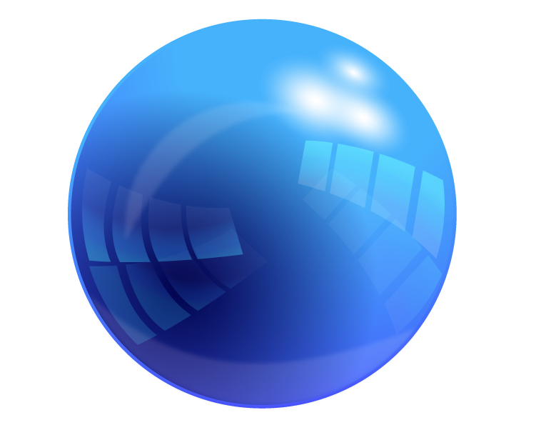
After our introduction to the glorious sphere, we branched out a bit more and found more interesting tutorials than that of a simple, red, sphere. It was then I dived into the realm of the SHINY. I found an absolutely BEAUTIFUL sphere tutorial right off of the bat (Found Here), and it wasn't easy, either! I  had to learn how to use\ things like compound paths and division tools to eventually come out with what you see to the left! I started with a sphere, then applies layers and layers of gradient on top of it to create the coveted reflective effect! I had to repeat many steps and redo a lot of shapes, but I feel it was worth it! It shines like a glass marble!


Then, after wrangling Illustrator, we hopped back over to the more familiar Photoshop, which didn't turn out to be as familiar as usual with this new tutorial! With a HEAVY use of layer masks and a rather simple look to it, this glossy sphere was a lot less complex in build than the Illustrator variety. I had to adapt to the use of layer masks, and have learned a few more tricks to mastering them! (except for the vector mask, I would like to learn and understand how that one works) I like the glow affect that sits around the edges, but not the biggest fan of the sudden cut off to the lighter gloss. I liked the softer tone better. For my own experiment, i put a textured type within the sphere, duplicating the main body and layering it between the two copies, the upper one with a lowered opacity to give the feel of being inside the sphere itself, like on of those bouncy balls with they toy dinosaur inside. I don't like it too much, but I try to follow the creative mantra of "Fail Faster", and did it anyway to see what i could manage with it, which wasn't as much as I'd have hoped. I had to keep it off center to prevent a clash  the composition with the corner of the G and the edge of the glare.

In contrast, the spheres have very different qualities to them. As always, the Illustrator sphere is more versatile. That doesn't go to say this Photoshop marble is without value! It is an easy format for the effect I tried to display, of objects within. I feel that it may have been cooler to make small bubbles of the sphere ad put them inside the sphere, like a carbonated drink. Each with their own color, but always a alight tint of the mother green. I found that In Photoshop, making a shadow is much easier. I don't have to worry about a stroke or a path, like in Illustrator, or worry about the shape not transforming the inner gradient with it. The blur is more appreciated there, Lastly, in contrast of the two methods, The Illustrator version's reflections and gradients are crisper and cleaner than Photoshop can normally acquire without some skill. In Illustrator, it more readily handles the crisp, sharp contrast of he brilliant shiny sphere, while Photoshop sits happily with it's fuzzy, blurry gradients that provide a warmer feel to them than a crisp and cold glare.


Sphere

Last week, we started working with spheres. We started out with a good, old, hand drawn sphere on paper. With a template, we went over values and shading that go into a sphere, creating the beloved optical illusion of depth on paper. here, we have my copy of the sphere page. I tried to stay away from pure white, and the effect made the sphere seem more muted in color, which is't bad, but not quite my aim for this one. I've always loved shiny things.

After our initiation to the sphere that i was, for the most part, VERY familiar with, We moved to the computer, and opened up Illustrator. Creating a sphere in illustrator isn't hard, and there are many simple ways to do it, but the red to black gradient we used just looks gross to me here. In hindsight, I should've gone with a darker read rather than flat out black. This would eliminate the muddy color and make it more appealing. Working with this newly made sphere is easy in Illustrator, with it's re-sizing capabilities, and makes for a versatile object.


On the other hand, we have Photoshop. I liked the look of this red sphere much more, a softer aesthetic and a gentle gradient. The shadow, however, I wish I had been able to use tricks I've only recently acquired on. It doesn't blur like I would wish it to. The difference in Photoshop, is that instead of manipulating a circle, you have a space filled with colored pixels that you cut off and them fill with a gradient. This makes the Photoshop sphere much less editable and versatile in almost any respect. Re-sizing such a sphere will make it pixel-y if the size is increased.


When it comes to preference, it's a tough choice. both methods are very different, and give similar results. I have found that, if I would like to have a sphere template, to which I can edit the color and glossiness with ease, then illustrator would be best, with it's gradient editor and paths. I like the look of the Photoshop sphere, and enjoyed making it more, but the uses are less outside of Photoshop itself.

It's a bit of a mental hoop to jump through to understand both Vector and Pixel graphics, but understanding both is a nice harmony and gives me a wider range of versatility.

Monday, October 6, 2014

Logo Development

Recently, it became relevant that I develop a logo for myself, so I dived into my sketchbook for some quick ideas to get me going. My two main thoughts involved a cube (Lined up isometrically or a little lower in angle) or something forming in the shape of a capital G, which is my first initial. Not too many people have names starting with G, so I feel that it's something rather personal that represents me. It's like one of my points of uniqueness.

I also took a rabbit, or a creature similar to a rabbit, into consideration with my design. Quite a bit of my presence online involves a bunny (Many usernames on art-based sites, and other places, are typically either Bunytech or Bunnytech, for days when I can actually spell check my information before hitting the 'done' button) and there is a lot of positive symbolism that comes with the image of that animal. Rabbits carry symbolism of luck, speed, wit, and motion (preferably in a forward direction). I want people to perceive me as a positive or energetic person, one that has the motivation to get stuff done.


So these were my sketches, and matter messing with the cube and the rabbit, I started to focus my attentions on the rabbit, as you can see below. I chose the colors Purple and green for personal reasons, but they also carry symbolism I'd like to affiliate with. The color purple is synonymous with both creativity and royalty, though the former is more of my goal with this model. Green, synonymous with nature, was a color I chose more to symbolize the green GO of a stoplight. I felt it went well with the idea of motion.

To start, I began messing around in illustrator with a box, but promptly gave up and decided to favor the running rabbit(?) idea.

I wanted to curve the rabbit into the shape of a capital G, letting it bend in the general 'C' shape, with it's ear pointing in to form the 'G'.

The most key thing I learned, in my opinion, was how to effectively manipulate strokes. With the aid of the might width tool, I finally surmounted one of my greatest challenges and conquered the vector path (To a pretty great extent). With this leap forward into illustrator, I have seemed to overcome my previous hurdle that was my relative intimidation from illustrator. Being used to the pixel-based programs of Photoshop and Autodesk Sketchbook, it was certainly a mental leap for me. I desire to be able to go further into the conveniently infinitely-scale-able realm of illustrator, for more versatile designs! 


Taking into account the picture above, of my nearly full art-board, I felt that I did well in the department of experimentation, I even tried things I felt may look stupid just in case!

And below, you ca see the finished(sh) product that I came up with! I was a fan of many of the designs, but some came out to cluttered, or took too much focus from what I personally wanted to achieve.

The end result was, in the end, the running bunny, which doesn't QUITE look like a bunny, but I feel it is close enough, looking like more of a jackrabbit with a cartoon-ish motion blur dashing behind it. The inner green circle turned into a green ring, which then became a hoop when i accidentally shifted one of the legs behind the ring, and by a happy accident, I had the bunny suddenly jumping though the newly made hoop. This flew by really well with others that saw it, and myself, so i gave it (the ring) a gradient to finish it up. The gradient gives a kind of a sunrise feel to it, and adds some visual interest beyond the flat shapes and color.


With that design in my head, i tested in in gray-scale.When I transferred it, i ditched the ring gradient, for it didn't add to the design at all in that state, and it looked much more balanced without it, but it still needed a bit more POP. So give it that visual interest, I gave the lighter colors, namely the ring and the eyes, a bit of a glow to contrast with any darker backgrounds that it may be placed on. 

That gave it a nighttime feel, and I can almost see a stark contrast in terms of daytime/nighttime between the two logos. I am very happy with the result!

In the future with these kinds of designs, I will try to do a batter job of catching little visual quirks that mess up the intended focus of the piece. I'd hate to come up with a nice design that people do not catch the cleverness of. Next time, I will make sure to take a step back form it, and collect much more feedback! But for now, I am quite content!

Friday, October 3, 2014

Shiny Shield tutorial


(Tutorial Link)

In the shiny shield tutorial, I went step by step to create just what the name implies: a glossy shield.
I went on my own with the colors, and could get the shape down easily! This tutorial taught me some applications for using the muti-stroke function, and how to use gradients to create luster.
In this tutorial, i feel that I did well with creating the shape and applying the styles, but I struggled mightily with the high gloss section in the corner. The way the tutorial described it (with the multiply function), wasn't working, so I changed it up a little bit.
Instead of using a black-to white gradient with a layer mask, i just used a simple white-to-transparent gradient for the gloss. It was much easier and got the same effect.

After this, I would like to go more in-depth in creating both high and low glosses on different shaped surfaces both 2D and 3D.

Friday, September 12, 2014

Font anatomy


What's in a font?

Well, in class we each took a test to see what font supposedly describes each of us the best.
My font was Architype Van Doesman, accompanied with the traits of 
-Emotional
-Assertive
-Progressive
And 
-Disciplined

Architype Van Doesman is an interesting font where all letters take up an equal amount of space, and I find it very balanced.


Looking at these words, I find that they fit me in different ways.

I am indeed very emotional and passionate about the things I love, and will talk or work for hours on something that drives me.

When it comes to assertive, I do try my best to let my ideas be known to others, and will try quite hard to be heard over a din, or a noisy group. And I love to let my work stand out on it's own!

Progressive; now that's a word I can go with. I am always open to new tools and ways of doing things that will go faster and more easily! All the new computer programs and such, I love so many of them.

And in terms of disciplined, however, it's more of a loose term. I do meet my deadlines, and can be very particular about things, but there are some things where I cannot bring myself to commit. So out of the words, that one is the most iffy, but if I'm motivated and driven, i am VERY disciplined with my work!

Friday, August 29, 2014

Pencil Design


When it comes to graphic design, one of the many tools you come around to using is Adobe Illustrator. it's a vector-based program with a mean learning curve. So to start off we made  a step-by-step basic vector pencil. As soon as you understood what was going on in each step, it became easier to create and alter. One of the big things I learned from this first project was: That you can actually detach nested tool groups and transform them into a window. This was very helpful to me in this and the next project.


The next step was to elaborate on the skills that you learned the first time around, to create a more personal pencil. I went with purple, since it's a color I'm quite inclined to. The difference and learning this time around was in the use of gradients, joining, and the deceptions of the live paint bucket tool.

I was shown that the live paint bucket tool creates a separate fill layer instead of joining a fill to the actual lines, making moving these shapes hard. Instead, it was easier to join shapes with 'Command+J' and insert a fill beyond that. My biggest takeaway from this part was the use of gradient fill being more versatile than the paint bucket.


The third part was to create your own pair of complimentary objects, and it was there that I discovered the wonderful use of the option button with the scroll wheel. It allowed me free zoom and made this part a lot easier! I had to wrestle with the ship, however, a the triangles needed to be mad outside the group before they could be added, or the gradients wouldn't align right and try to cut off at the underlaying paths. The planet still isn't aligned right, but I do not know how to fix it.

So in summary: The biggest three things I learned were:

-The paint bucket tool is not as friendly to moving shapes as regular gradient fill used with the join tool.

-Free zoom scroll can be activated by holding 'Option'

-Nested docks can be detached and made into windows by clicking the bar on the right when expanded.

I hope to learn more about this program as I continue to use it!

Friday, August 22, 2014

What is Graphic Design?

"It can mean a lot of things, can't it?"


Coming into the realm of the graphic design class, we were set off to discover what the word meant to the rest of the world, and to us. When I, personally, think of graphic design, I think of colors, shapes, and perfectly placed contrast all used in harmony to draw the eyes of whoever looks at it to a certain area of the image in a certain order.
Like a book title, it aims to draw you to it's cover with the design, and to the title next to display what it is in all it's glory. 

(My oh my, don't my word choices make me sound so preachy?)

Learning graphic design is like learning how to grab someone's attention. Learning how  to make them feel a certain way, understand a certain concept. it's almost to me, appearing like a subliminal art that gets into someone's head and makes them think certain things or feel a certain way.

Like an advertisement that invokes a sense of pity or tugs at your heartstrings to get you to donate. Like a sleek ad that just screams 'New!' or 'Shiny' at you to convince you to get that new car. Though this art isn't restricted only to advertisements.

I am exited to learn the art of inspiring people and communicating my message through my designs, and I hope when people see my future works that they get something from it to take home, and possibly create things of their own for the inspiration I give them.

It's always been enthralling to see someone creating something based on something they saw from me. I love to create, and I get the same thrill form inspiring others to create. I feel that this is why graphic design is so appealing to me.
It's the art of communicating ideas, sharing feelings, and that maybe why I feel such a deep connection to (And am so exited by) the idea of it.