Showing posts with label Photoshop. Show all posts

Thursday, December 18, 2014

Postcards From Nowhere


Seasons greetings!

(Whatever season it may be)

At the time of posting, it's about that time of year that people go about sending cards to each other to let them know what they're missing out on. So, it only seemed fitting that I work on some postcards to get some new Photoshop skills under my belt! Granted, I didn't get too much into the Christmas spirit at the time, so I stated off with a postcard about my favorite season: Fall!


The skill I demonstrate with this simple card is the use of clipping masks!

As you can see, there a nice, autumn-themed images nestled in the text. Now, how does one do this? Clipping masks! A clipping mask is an effect that allows me to frame one image within the boundaries of another. For example: framing the image of the apples in the letter A. (because apples starts with A, ehehehehe)

I used some glow and stroke effects on the text to make them have more 'POP' in the image.


Next, there was a call to make a personal postcard for ourselves! I may not be a destination, but that didn't stop me from trying to represent myself as well as possible in the card! Now, image wise, I tried to incorporate as much of my original work as possible. So, the last four letters of my name have pictures I created all by myself. (The first I have incorporated my favorite bird, the potoo bird). For the main back image, I found a shining sky and clouds background, to represent my head being 'in the clouds', and reaching for 'sky high'. To contrast it, I placed a storm in the thought bubble of the majestic Jackalope. (Kind of like a brainstorm, right?)


So, To create a nice balance of bright, shining colors, I delayered the clouds on top of themselves, and applied a screen to the top layer. To add even more shine, I put a light yellow, transparent ray of light over the majority of the image These effects gave the whole image a surreal, dreamy feel to it. The Jackalope only seems to add to the fantastical feeling.

And for any who are curious as to what are in those letters, they are a variety of creatures that I have drawn within the last year. All of the full images can be found on my
Deviantart account, as linked above.


The pinnacle of this venture, the icing on the cake, perhaps, was an independent card, made with no tutorial (though, in the model of another) over a theme or topic of my choice. Since I was, again, not in a christmas mood at the time, I went with the theme of sugary sweets of the colorful, fruity kind. (Maybe I was just hungry) To start, I had to extract the two gummy bears, one having it's ear overlapped. To fix the chunk of ear missing, I made a bite out of it.

one difficulty I encountered was the picture of the candy (Clipping mask+stroke), as it looked too powdery and light. One way I fixed with was to do something similar to what I did to the sky background on my personal card: I made a duplicate of the layer, but instead of a lightening screen, I gave it an overlay filter t make the colors more vibrant and bring out the contrast to a higher degree. Now, doesn't that big lollipop in the back just make you hungry? The degree of quality gets me every time.

Lastly, to make things pop, everything has it's own little drop shadow: giving the picture a sense of depth and letting each element separate from being lost in all the details.


Tuesday, December 9, 2014

Shadow Time


Recently, we attempted a shadow tutorial for Photoshop. We were to extract an image, remove the pixel fringe, then create a shadow for it on a landscape that it was not originally matched to. So, I chose a chipmunk as my shadow model. With a mirrored and skewed image of the chipmunk overlaid behind, I tweaked it's shadow to match the background.

The trick? Gradient overlay! How did that work? We'll get there in a moment! If we take it one task at a time, then we truly start by removing the chipmunk from it's habitat. Using the refine radius tool (Which is good at selecting fur and thin parts of a selection) I got a relatively clean, transparent clip
 Now for that tricky overlay! If we take the chipmunk, copy him, and skew him off to the side, it looks more like a mirror than a shadow, doesn't it? But, here's where the gradient overlay come sin to play!

An overlay layers a color, gradient, or image over a layer. So, if the shadow chipmunk is a layer, I can layer a black to BG gradient over it, and the result is...


A Shadow!


Wednesday, November 12, 2014

The Intriguing Quandary of Photoshop

The Re-Greta-ble mountains


For this mini-project, we went through the process of extracting a mountain and placing it on a sky background, to make  surreal floating effect. Using a quick selection and duplicating certain parts of the mountain to give it a smooth bottom, I was able to make a solid, solitary rock out of a complete scene. The hardest and most intricate part of this was getting the mountain and the sky to match up enough in color so that they did not seem to clash or be out of place.

Using the color adjustments (Hue and saturation adjustment) and layer styles (Multiply, screen, soft light, etc.) I was able to match them. I used a similar technique on the other animals, but they do not quite match as well. For all objects in the scene, I used the quick select and refine edge/refine radius tool to get my selection. I used both a selection expansion and a manual eraser to eliminate my pixel fringe.

The result, clad with a pun-derful name, wasn't bad, but I probably could have feathered (aha) the bird a little bit to blend it better.

If anyone hasn't seen the spider yet, now may be time to look, ehe.

Here I learned about color and resolution blending, and how certain resolution images, like the bird, have a tendency to clash with the rest of a more blurred photo, unlike the fish or spider. The crisp details contrasted with other details of the image. I also messed with a soft layer mask to take the harsher bits of the fish out of the picture for a more seamless insertion.

Next time, I will be sure to find more complimentary images and extract them with more precision.


Wednesday, October 22, 2014

A Spherical Adventure

Spheres, simple shapes, right? such a shape holds a lot of meaning when used properly. Spheres can reflect uniformity, creativity, continuity, and even forward motion with a straightforward rolling, or an excitable bounce! This s not endemic to the sphere alone, though. it's 2D counterpart, the circle, also carries feelings of balance, unity,  a free flowing feeling, or even a window. Both are good tools in one's arsenal, but recently, I've put my thoughts into spheres (as you may have seen by my last post)!


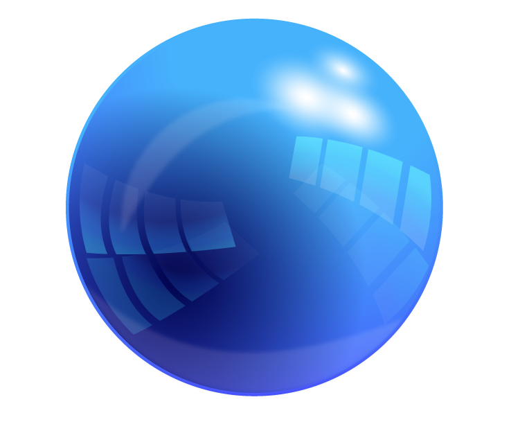
After our introduction to the glorious sphere, we branched out a bit more and found more interesting tutorials than that of a simple, red, sphere. It was then I dived into the realm of the SHINY. I found an absolutely BEAUTIFUL sphere tutorial right off of the bat (Found Here), and it wasn't easy, either! I  had to learn how to use\ things like compound paths and division tools to eventually come out with what you see to the left! I started with a sphere, then applies layers and layers of gradient on top of it to create the coveted reflective effect! I had to repeat many steps and redo a lot of shapes, but I feel it was worth it! It shines like a glass marble!


Then, after wrangling Illustrator, we hopped back over to the more familiar Photoshop, which didn't turn out to be as familiar as usual with this new tutorial! With a HEAVY use of layer masks and a rather simple look to it, this glossy sphere was a lot less complex in build than the Illustrator variety. I had to adapt to the use of layer masks, and have learned a few more tricks to mastering them! (except for the vector mask, I would like to learn and understand how that one works) I like the glow affect that sits around the edges, but not the biggest fan of the sudden cut off to the lighter gloss. I liked the softer tone better. For my own experiment, i put a textured type within the sphere, duplicating the main body and layering it between the two copies, the upper one with a lowered opacity to give the feel of being inside the sphere itself, like on of those bouncy balls with they toy dinosaur inside. I don't like it too much, but I try to follow the creative mantra of "Fail Faster", and did it anyway to see what i could manage with it, which wasn't as much as I'd have hoped. I had to keep it off center to prevent a clash  the composition with the corner of the G and the edge of the glare.

In contrast, the spheres have very different qualities to them. As always, the Illustrator sphere is more versatile. That doesn't go to say this Photoshop marble is without value! It is an easy format for the effect I tried to display, of objects within. I feel that it may have been cooler to make small bubbles of the sphere ad put them inside the sphere, like a carbonated drink. Each with their own color, but always a alight tint of the mother green. I found that In Photoshop, making a shadow is much easier. I don't have to worry about a stroke or a path, like in Illustrator, or worry about the shape not transforming the inner gradient with it. The blur is more appreciated there, Lastly, in contrast of the two methods, The Illustrator version's reflections and gradients are crisper and cleaner than Photoshop can normally acquire without some skill. In Illustrator, it more readily handles the crisp, sharp contrast of he brilliant shiny sphere, while Photoshop sits happily with it's fuzzy, blurry gradients that provide a warmer feel to them than a crisp and cold glare.


Sphere

Last week, we started working with spheres. We started out with a good, old, hand drawn sphere on paper. With a template, we went over values and shading that go into a sphere, creating the beloved optical illusion of depth on paper. here, we have my copy of the sphere page. I tried to stay away from pure white, and the effect made the sphere seem more muted in color, which is't bad, but not quite my aim for this one. I've always loved shiny things.

After our initiation to the sphere that i was, for the most part, VERY familiar with, We moved to the computer, and opened up Illustrator. Creating a sphere in illustrator isn't hard, and there are many simple ways to do it, but the red to black gradient we used just looks gross to me here. In hindsight, I should've gone with a darker read rather than flat out black. This would eliminate the muddy color and make it more appealing. Working with this newly made sphere is easy in Illustrator, with it's re-sizing capabilities, and makes for a versatile object.


On the other hand, we have Photoshop. I liked the look of this red sphere much more, a softer aesthetic and a gentle gradient. The shadow, however, I wish I had been able to use tricks I've only recently acquired on. It doesn't blur like I would wish it to. The difference in Photoshop, is that instead of manipulating a circle, you have a space filled with colored pixels that you cut off and them fill with a gradient. This makes the Photoshop sphere much less editable and versatile in almost any respect. Re-sizing such a sphere will make it pixel-y if the size is increased.


When it comes to preference, it's a tough choice. both methods are very different, and give similar results. I have found that, if I would like to have a sphere template, to which I can edit the color and glossiness with ease, then illustrator would be best, with it's gradient editor and paths. I like the look of the Photoshop sphere, and enjoyed making it more, but the uses are less outside of Photoshop itself.

It's a bit of a mental hoop to jump through to understand both Vector and Pixel graphics, but understanding both is a nice harmony and gives me a wider range of versatility.