Spheres, simple shapes, right? such a shape holds a lot of meaning when used properly. Spheres can reflect uniformity, creativity, continuity, and even forward motion with a straightforward rolling, or an excitable bounce! This s not endemic to the sphere alone, though. it's 2D counterpart, the circle, also carries feelings of balance, unity, a free flowing feeling, or even a window. Both are good tools in one's arsenal, but recently, I've put my thoughts into spheres (as you may have seen by my last post)!

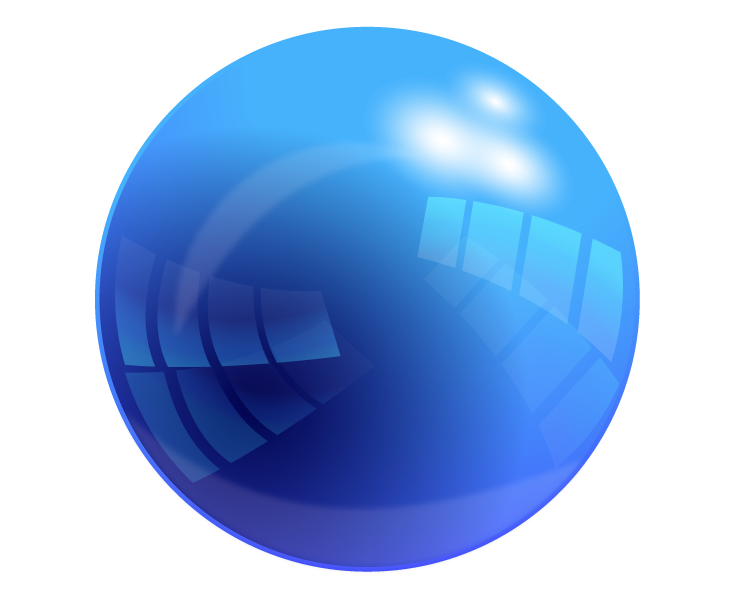
After our introduction to the glorious sphere, we branched out a bit more and found more interesting tutorials than that of a simple, red, sphere. It was then I dived into the realm of the SHINY. I found an absolutely BEAUTIFUL sphere tutorial right off of the bat (Found Here), and it wasn't easy, either! I had to learn how to use\ things like compound paths and division tools to eventually come out with what you see to the left! I started with a sphere, then applies layers and layers of gradient on top of it to create the coveted reflective effect! I had to repeat many steps and redo a lot of shapes, but I feel it was worth it! It shines like a glass marble!
Then, after wrangling Illustrator, we hopped back over to the more familiar Photoshop, which didn't turn out to be as familiar as usual with this new tutorial! With a HEAVY use of layer masks and a rather simple look to it, this glossy sphere was a lot less complex in build than the Illustrator variety. I had to adapt to the use of layer masks, and have learned a few more tricks to mastering them! (except for the vector mask, I would like to learn and understand how that one works) I like the glow affect that sits around the edges, but not the biggest fan of the sudden cut off to the lighter gloss. I liked the softer tone better. For my own experiment, i put a textured type within the sphere, duplicating the main body and layering it between the two copies, the upper one with a lowered opacity to give the feel of being inside the sphere itself, like on of those bouncy balls with they toy dinosaur inside. I don't like it too much, but I try to follow the creative mantra of "Fail Faster", and did it anyway to see what i could manage with it, which wasn't as much as I'd have hoped. I had to keep it off center to prevent a clash the composition with the corner of the G and the edge of the glare.
In contrast, the spheres have very different qualities to them. As always, the Illustrator sphere is more versatile. That doesn't go to say this Photoshop marble is without value! It is an easy format for the effect I tried to display, of objects within. I feel that it may have been cooler to make small bubbles of the sphere ad put them inside the sphere, like a carbonated drink. Each with their own color, but always a alight tint of the mother green. I found that In Photoshop, making a shadow is much easier. I don't have to worry about a stroke or a path, like in Illustrator, or worry about the shape not transforming the inner gradient with it. The blur is more appreciated there, Lastly, in contrast of the two methods, The Illustrator version's reflections and gradients are crisper and cleaner than Photoshop can normally acquire without some skill. In Illustrator, it more readily handles the crisp, sharp contrast of he brilliant shiny sphere, while Photoshop sits happily with it's fuzzy, blurry gradients that provide a warmer feel to them than a crisp and cold glare.
In contrast, the spheres have very different qualities to them. As always, the Illustrator sphere is more versatile. That doesn't go to say this Photoshop marble is without value! It is an easy format for the effect I tried to display, of objects within. I feel that it may have been cooler to make small bubbles of the sphere ad put them inside the sphere, like a carbonated drink. Each with their own color, but always a alight tint of the mother green. I found that In Photoshop, making a shadow is much easier. I don't have to worry about a stroke or a path, like in Illustrator, or worry about the shape not transforming the inner gradient with it. The blur is more appreciated there, Lastly, in contrast of the two methods, The Illustrator version's reflections and gradients are crisper and cleaner than Photoshop can normally acquire without some skill. In Illustrator, it more readily handles the crisp, sharp contrast of he brilliant shiny sphere, while Photoshop sits happily with it's fuzzy, blurry gradients that provide a warmer feel to them than a crisp and cold glare.


Awesomer!
ReplyDelete