Tuesday, December 15, 2015

Petri Swallow: Large Project Turned Learning Experience

So what happens when you underestimate a project?

You learn. Fast.


Say hello to Pertri: a small bird with a big problem. We'll get to that problem later. For now, allow me to introduce you officially to the project I have been working on for the past semester. Now, what I expected Petri to become was is far removed from what he ended up being (not to mention that they went though several gender changes and arguments before I finally gave in to calling Petri a 'he' like everyone else did). Here is an overview of what I had expected at the start of the semester:


It started from a simple sketch, a small bird with a broom cleaning alligator's teeth like a dentist-janitor combo. I, having designed the bird to be more or less simple and round, chose Petri to be the star of my first semester animation project.

Little did I know how much work that would turn out to be.


The story went as so: 

Petri flies into work one day to attend to a large clint with a larger problem: there's one tooth that just won't get clean.

Petri tries and tries to clean it, using all sorts of unorthodox methods, but no matter what he does, nothing helps. In the end, in frustration, he ends up accidentally breaking the tooth, bringing about his untimely demise at the hands, er-mouth, of the gator.

I had a storyboard, but the pencil marks were to light and smudged to scan and show you.

So, to the real problem:

Oh wait, not that problem.


This problem:


(You can tell it's the real problem because I made it larger)

This is what happens when you don't construct your rig quite right
The name of this problem? Rigging. For those of you who don't know or are unfamiliar with rigging: rigging is the placement of bones in an animated character to make animation easier and to define character movement. In essence, constructing their skeleton, as you can see above. 

Now you may be thinking: "But Greta, that looks like a fine and dandy skillet rig you've got going there, what's the problem?" But my friend, I must tell you this is the finished, refined rig of the bird. While it doesn't look much different from the initial setup, it is far better at what is was built to do that version 1.0. 


To get to this stage of superior rigging, I went through modeling, rigging, assigning bones to joints, beginning animation, and then undoing all my work until I was back at square two: rigging. Because of this, I have no true finished "animation", but the amount I have learned from the project makes all the struggle and turmoil and headaches worth it. For example: The prop and scenery work shown below from what I had anticipated to be part of the final work.


The most valuable skill I gained from this is the proper, or at least more efficient, way to rig a character in Maya. IK rigging is a kind of rigging shortcut that takes where you want a certain joint to be, and moves all subsequent joints in a way that will get it there. It takes longer to set up, but makes the actual animating a whole world easier.

So, in summary, will I be putting forth more effort to get something done right next semester?

Yup. I want to be able to get something completed this time.

Will I grossly underestimate the scope of a project?

I hope not. I need to take careful consideration of what difficulties the next project will have.

Will I be using IK rigging the first time?

Oh yes. It's a very handy tool and I hope to perfect my work on it.

Will you all be seeing more of me and my work next year?

You bet! I want to be more active on this blog, so I may also post some non-animation art ventures to keep this place a tad more lively!

Remember, if you have anything to say leave it in the comments! I like to get feedback and hear what you all think!

Friday, October 9, 2015

Acting in Animation

Acting? What does that have to do with Animation?

More than you'd expect, it seems


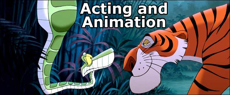
Today I took a look at Doron A. Meir's article on acting and animation. While the title intrigued me, the content did more so. In his article, Meir covers what it really means to bring a character to life in animation. He doesn't just mean the story or even the design, but the movement of a character in itself, whether you were the one directing the story or just working off a given script, Meir stresses the importance of acting.

Meir claims that modern animations have come to lack the higher quality of acting in their animation as seen in older works. He sees the characters as well modeled, but poorly developed and poorly acted. He sees the character move, but he can no longer feel them working as an individual character. Meir's definition of acting requires that the animator can think, feel, react, and retain the consistency of the character in a way that makes the audience believe that the character is a real, living, breathing (where applicable), thinking individual: a practice that is much harder than you may think.

While Meir may have a good point, they provide little to no evidence to support their claims on neither the loss of acting nor any way to bring it back to the spotlight. Meir gives us no clear examples of a poorly acted and well-acted character in any more detail than a name. This, unfortunately, detracts from their interesting argument a little, giving us no more than some textbook terms on how to feel, react, and set the mood.

Despite the detraction from his validity, Meir does bring up an interesting point, whether or not this is becoming less prevalent: how to do more than make a character move. What Meir misses in the things he sees are the extra thoughts and effort to truly develop a character. Sometimes I can see what he means by it, too. I need to be sure to, with my own characters, bring to life their personalities and make them empathize-able on-screen to the viewers.


See the article yourself at:

http://www.animationarena.com/acting-and-animation.html


Friday, September 4, 2015

Let's Take A Look

Big Buck Bunny:

Professional Project Review


Today I'm going to talk about something I didn't make: a wonderfully made short film by the folks who developed the software Blender. Big Buck Bunny (2008) was made to showcase the capacity their free product could create with.

Big Buck Bunny tells the story of a large, gentle bunny that is endlessly tormented by squirrels. One day he decides to rebel and strike back against the squirrels with crafty traps. The short film is well put together, with a 3D modeled environment and characters that are accented with the excellent lighting. While most of the camera shots are close, the people at Blender still manage to establish a deceptively calm, pretty meow setting to contrast the actions of the squirrels. The short film sets up many similar contrasts such as:

-The bunny is oddly large and relatively masculine, but still acts dainty at the beginning
-The squirrels appear small and cute at the beginning, but slowly are revealed to be menaces
-The setting is serene and there are beautiful butterflies, but they are crushed by squirrels

If I were to take something away from this piece to apply to my own work, it would be creative use of camera angles and lighting. Since there is no dialogue, they communicated the story through gestures, faces, and angles. I am quite a ways away from that level of camera angle usage. One thing I saw that I can do, however, is the lighting. While I by no means can accomplish the lighting they have, I can identify possible ways they accomplished theirs. 

The only thing I could bring myself to critique is the grass texture, which at times seemed off, but even that wasn't detrimental to the film as a whole.

If I were given the task of improving it, I would probably look into developing the squirrels motives a teeny bit, but that'd be it. 

All in all, This short film is a funny, well-timed work that is definitely worth giving a watch if you like humorous story lines and comedic characters.

Friday, July 3, 2015

Summer Design Doodles

It's Been A While;

Here's a small update for you all


So, between camps and trudging through summer assignments, I have put some work into my designing skills. Specifically: creature design (One of my passions). For this, I just drew away at an empty canvas until it was full to the brim with ideas. (Some old, some new) I have found this kind of exercise to be both helpful to my skills and my peace of mind. Doodling with nothing in mind helps me to calm down or relax. And to be honest, I think I had some real gems come out of this sheet (More or less that grassy snake and SNAKEOPOTTAMUS).


Beyond that large project, I also put some time into minor world building and Sci-Fi designs. (science fiction being one of my favorite story settings) In particular, however, I focused on alien technology and biology (Both of which I find absolutely fun to create).

The struggle with this particular robot to the left was the way in which I wanted to get my concept across. I knew I wanted it to have two specific modes, but I didn't want the long, tedious work of coloring both ideas in, or making sure that they looked similar enough to be the same machine. With some tweaking, I was able to use the same sketch layer for both robots, allowing me to maintain proportions and size throughout the designing process.

In terms of coloring, you can see I clearly took a few shortcuts, taking the  most common color and slathering it behind the lines messily, yet effectively. (There is a certain art to making something look sloppy in just the right way and I by no means have gotten that one down

And as a bonus, here are some more creature designs from earlier in the year:


Tuesday, May 19, 2015

E.T. - Extra Technological

THE HOME STRETCH:

Robot Meets Life Meets Cumulative Final Project


Meet Robo: A rising star in the student movie clip industry. While he may not appear to be much, it was our task to give him his premier debut.

Well, maybe that wasn't exactly the outline of the project, but it's pretty close. Our real assignment was to apply all that we have learned into a group project. These new skills we aimed to apply were skills like 3D modeling, lighting, using a green screen, and special effects. My team: Jessica LoveJessie Blom, and myself. With our combined powers, we got down to business.


To start off, we dove into the essence of the plot: the storyboard. Since storyboarding is something I particularly like to do, I took charge and scribbled our cheesy ideas down. (Now, I know my art can be better than this, but we didn't want to spend so much time on this) We came up with the idea of parodying that one scene from E.T., but with a robot on another planet. Robots: what could possibly go wrong? (Maya, that's what, but more about that later)

We went though a few hardcore rounds of 'nose-goes' and Jessica came out as our actor. So, while my comrades trekked down to the green screen studio, I stayed behind as our resident "Maya Master". For those unfamiliar, Autodesk Maya is a  3D modeling program, and the one we happened to have in the classroom. It's not a bad program, but it does have it's quirks. Some of those quirks, I've found, can be rather, or more accurately, extremely frustrating. But we'll get to that story.


Looks OK now, but...
I had an absolute blast modeling our resident star in Maya. Being a robot, he was easily composed of inorganic shapes which are much easier to make in maya than say, a hand. The special touch I added this time was parenting

Parenting, beyond the maternal and paternal varieties, is the act of taking one shape, and sticking it to another shape. This means that, if I move the parent shape, all child shapes below it will move, but not any shapes that the parent is parented. it's like a big tree, branches of children extending from the one, mighty parent at the bottom. If that shape moves, all the rest follow. This was crucial to having our robot move since who would want a robot whose elbow didn't move with it's shoulder? or its torso? No one, that's who. I put my heart and soul into perfecting our co-star.


Look at this absolute mess

The final trial on the modeling before animation was the wrists. (You can see they don't move in the final product) 

This was a rather blunt showcase of one of maya's specialties: Screwing up the simple stuff. I mean, just look at what it did to poor Pasted_cylinder_RWrist. 

Complete disaster. 

But, nevertheless, I persevered and came out with our amazing robot: Robo. A few shiny textures later and we were on the fast track.


ROBO in his completed glory


On the flip side of our team, we'd gathered our green screen shots together to key them out. By 'key out', I mean remove that bright green color from the background and replace with with something cool.

After compiling our efforts, we added the nifty sounds of Celldweller's The Wings of Icarus and Viola, we had our project. (It's a cool track, I'd listen to the whole thing if the clip interests you, it's interesting music for sure)


This project, overall, has taught me some of the more in depth abilities of Maya. I learned how to apply my knowledge of shapes, Booleans, parenting, and even aligning to make the robot reach it's highest degree of excellence. Outside of my new-found technical prowess, We, as a team, also gained more experience in team synergy and division of labor. (This is something I need more practice in for sure)

For future projects, I feel that I'd like to keep with the group dynamic we had for this one, but with more communication. I felt it may have been smart to check each other more often so that we are all and the same track. I also feel that, as we all improve in our chosen tracks, that we'll find even more smooth and easy teamwork styles to use. I await being able to work with the people I have seen in the future. And without further ado: our project:


Friday, May 15, 2015

FOOD-IMALS

Package Design:

Can we take it to the next level?

(of course we can)


The Task:


Take a toy, any toy, and redesign it's package to not lonely look snazzy, but to have a hidden purpose behind carrying the goods. The first question on this matter, we found (We being Me and my accomplice), was A: "What toy" and B: "What will make this box really snazzy and cool". After going through ideas involving A gentleman bear, a car garage, and multiple other sketches of dollhouses, we sat down and realized how hungry we were.

And then, inspiration struck us with the full force of our stomachs:


And so, FOOD-IMALS WAS BORN.


The Process:


The first (and most challenging) task before us was to create the MYSTERY FRIDGE. We wanted to make a flat template that could be folded in such a way as to make a two-story fridge that could hold two little plush Food-imals with a working door. This was a little harder than it sounds (Unless it sounds moderately tricky to you, then you, my friend, are on point).

After a day or so of wrestling, experimentation, and cheese snacks, we'd finally come up with this template:


We designed the middle sections to fold inwards to make the middle shelf, causing the rest of the box to squish back together into a rectangular prism. The end result of the folded box looks like this:


In terms of designs and color, we went with primary almost-pastel colors for a childlike feel. Then, we played around with the different foods we could make this little cat orb into:

IN THE END: He became a cherry

With this cute little fellow in tow, we made the logo appear as a magnet for the completed fridge look.

The Challenges:

First of all: making the template was a huge block. But as we already discussed that one, I'll talk about the second challenge: the deadline. Now, this project may not seem too tough, but when you only have a week (and an average of less than an hour per day) to work on it, things can get a little tricky. This was only compounded by my partner being out for the count for the first few days.

Despite this, however, we managed to be one of the very few to submit our template in time for print, and of that we are proud.

The Collaboration:

As I mentioned, this was a team project and the division of work between us was the key to our success. My usual hate of group projects was overlooked by our past friendship.

The Result:

Our package has not been printed yet, and when it is, I'll be sure to share the picture with you all!

Wednesday, May 13, 2015

One Screen Two Screen, Red Screen Blue Screen! (Don't Forget Green Screen)

Throughout the history of film, many artists have discovered different ways to "key out" or make a matte in their films:

Today, with the common use of the green screen, it it always a little interesting to 

see where the technique originated from.


The Magician's Medium:

Q: What was the magician's medium and how did it work?


We can all thank this Melies guy for going through
this process in the name of ART.
(And illusions. Mostly illusions)

A: The magician's medium was one of the first matting techniques used in film
allowing the filmmakers to expose certain parts of the film at a time and 
expose each to a new image separately upon re-filming. This was achieved 
with the use of black paint on each separate square of film. Other methods 
using painting included the tactic of painting over a pane of glass in front 
of the camera to create the fake scenery. While long and monotonous, this 
process was one of the first steps towards the fancy green
screen technologies we all know today in our weather forecasts and movies.
(Or even movies about weather forecasts, if that strikes your fancy)


Q: If they couldn't use green screens in black and white films, what did they use?


A: Black screens! Since the black and white films didn't have to worry
 about colors and the subtle contrasts involved with those, they could rely
 solely on lightness contrast to key out their subjects. The dark black of
 the screen would easily contrast with any lighter colors on there parson or
 object involved  making for a much more efficient method than 
painting over frames one by one!


Q: Did they only use black screens in Back and white films?


A: No, in fact, they began using the blue screen, or Dunning Process, in 
black and white films around the time when the mighty King Kong arrived on
 the big screens. Similar to the black screen, the blue screen helped create 
contrast in the subject, but instead of simply laying out black and white 
contrast, they brought out the differences between blue and yellow. However,
this technique would not be transferable to color film since to gain the correct 
contrast, the actors were lit in a bright yellow light.


Q: What did they do when they switched to color?


A: Well, this was not the case for any company but Disney, but the 
Yellow screen (Developed by Vlahos in the 50's) came into use in the films 
The Parent Trap, Marry Poppins, and more. With similar techniques to that of 
the previous screens, the Yellow screen was keyed out with a special 
prism camera. 
(Owned exclusively by Disney, of course)
This method was used by Disney for 40 years.

Q: What about everyone else? 


A: They used the Blue screen to chroma key their subjects out!


As shown by the graphic above, it took a lot of keying to get the subject 
out from a blue screen, but without the use of Disney's exclusive yellow 
screen and prism camera, they had to make do.

Q: So, if they had that, why do we only hear about green screens today?


A: Well, green screens came into use due to their cheaper nature, greater
obscurity in most outfits, and they've even made cameras that are more
sensitive to the green light. That doesn't mean the other colors have 
fallen into oblivion, however. The blues and yellows are still used today for
various needs and purposes.

(Information gathered from here)

GRO-XTL Fake Supplement Project

It may not be a real thing,

But that doesn't mean it's not cool beans


GRO-XTL: 

Though such a scientific feat has yet to become a reality, it was still fun to design a box for it. The task: design a fake supplement/pill and give it a snazzy container. To meet this task, I created GRO-XTL Limb regeneration formula.

To start off this project, as I do for most projects, I sketched some logos out. Luckily, the first sketch I came up with turned out to be a big hit and I went with that one right away. The logo is a mixture of a caduceus and an Axotl (the brilliant amphibian who we're studying at this moment to advance regeneration technologies). I gave the color scene plenty to cool, scientific colors. Green for the natural aspect, and blue for the technological aspect. I also adjusted the typeface to seems confident and professional.


Giving the container a generally peaceful feel, I put it to the test and printed it out for a 3D test run. The DNA patterns on the sides didn't quite match up, but that was okay. I was extremely satisfied with the turnout. I felt it completed it's task of marketing itself as reliable and a valid medication.

As a bonus, I made a medicine bottle to go with it:


Tuesday, April 21, 2015

e-MAGINE the Festivities

Greetings readers!


That's me on the left there. My friend Katelyn is on the right.

As you may or may not be aware, my high school Olathe northwest, hosts an annual digital media festival so gallantly named e-MAGINE.

Schools all across the Kansas-Missouri area converge on my home turf to display their digital proficiencies in animation, graphics design, video, and web design! With categories spreading from advertisements to 3D organic modeling, there was a place for everyone to show off their skills! To see what I mean, you can check out all of the entries here.

My Personal Entry:


Of course, there's no way that I wouldn't have submitted something to this event (especially given that I was required to attend regardless of participation), and I took a week of my like to animate one of the most bizarre character designs I have in my arsenal: Jeffely. (Whom you can search to see more of at my Deviant Art)

Now, Jeffely may not make any sense physically, but I can assure you that he's a full-fledged character with a fleshed-out personality (even if you can't see it from this simple loop animation) and I adore drawing him doing all sorts of things.

This perfect loop may have been seamless and well put together, but I only got into the top 5, and did not formally place, for I had not given the image any of his personality or story. But since I had not tried for any, I was not surprised. (At least I got on the slideshow this year)

Here's My Entry:


NEXT YEAR I plan to enter something amazing, something that contains sweat, blood, and passion poured into it over an extended time. I will strive to make a STORY. (And maybe even beat McCall)

So anticipate the best when it comes time to enter again! Wish me luck!

Tuesday, March 10, 2015

Mirroring Styles

In the Footsteps of Saul Bass

Minimalist Poster Design


When it comes to movie posters, there is a beauty in a non-cluttered, simple design. One man who had this style down to a T was Saul Bass: the creator of many Interesting posters. In honor of his accomplishments, We were tasked with making a poster of a movie from recent years (2010 or later, to be exact) in his style. 

The first step was defining his style: we narrowed it down to minimal color, two to three key elements, and a paper-cutout style rather than using actual images. (I cheated slightly on this style by using a gradient)

The first element I chose to include from my chosen movie, Super 8, was an alien hand reaching out, shadowed. To make this part, I simply created the outline with the pen tool in illustrator.

Point by point, I got a shape that looked enough like a hand to be recognized as one, but off-model enough to clearly be something not of earth, or alien to us, at least.

Additionally, I used a gradient throughout the poster to mimic the feel of dusk or a heavy fog, giving the poster and unsettling mood to it that mirrors the mood in the film: unsettling and unsure.

A second element I used was the likeness of a train. The train is a key plot point in the movie Super 8, and with the chance to make the train also have resemblance to a reel of film in keeping with the symbolism of the camera, it turned out to work well at the bottom as a kind of lower border. In hindsight, I would have removed the gradient form the train windows and left it a flat white.


The large central camera integrated with the title '8' was the finishing touch to tie all of the elements together, with more foggy gradient in the background to complete the mood. And with this last bit, I had my poster. There are surely things I would change looking back at it, but you can't just continuously correct everything. Sometimes you have to let something fall short to learn from it.


Fancying Text

A name, my name, what a wonderful thing to have.


In the name of uniqueness and custom graphics, I have ventured forth to learn how to take a name, and make it into something special. For this exercise, I used my own name since I am both familiar with it, and a fan of how the amount of letters in my first and last names are equal (as is my middle name, but that's for another time). I took advantage if this equal spacing to link certain letters together.

Unfortunately, at first, the font I had chosen was not of equal width, and the N in my last name took up three times the space I wished it to. Therefore, I had to convert the type to points and edit each little vertex manually. This is relatively easy in illustrator, as it willingly lines up text with itself, allowing the middles of each letter to connect.

The equal spacing and roundness of the letters was aesthetically pleasing when contrasted with the sharp corners, so when I came to this point I stopped and let it be. I wonder what I will do with this in the future.

Thursday, February 26, 2015

Value Poster

CONSUMPTION:

Not the eating kind, we're talking about the marketplace, here.


When you think of What you personally value, what comes to mind? Friends? Family? The rain on a warm spring day? Well, regardless of what you thought of, it's likely you're not quite sure how these values affect you and your choices.

Below is a poster I made in InDesign on ten things that I personally value. The picture may not be quite big enough to read, so I will summarize somewhat in a moment. The things you value and like directly affect what interests you and what you will and will not purchase within the context of the market. This is important for those on a branding team to understand, for if their appeal to the masses can't relate to their own personal values, then it will not sell as it would if it connected the consumer to something they already know they like.

To put this into context, imagine you're in a store looking for a new sports drink to try:

On the shelf are two brands of sports drink: one is in a generic plastic bottle labeled "Superdrink" in red letters, while the other is in a similar bottle, but with a label entitled "Ener-life" and a picture of a woman throwing a frisbee for her dog on it. If you are someone who likes to be active and likes pets, then the second drink will probably appeal more to you, causing you to choose Ener-life over the poor Superdrink whose design team obviously was not well trained.


When I sat down to think about it, I decided that things that were important to me consisted of many creative outlets, technology, comfort, and family. This indicates that someone like me would be more driven to buy things that have been designed to appeal to those values more than one that does not. Many people like vastly many different things, which makes appealing to them difficult if your product does not have a set age group or demographic in mind.


Miniature Typography Lesson

Can't just babble about marketing, let's throw in some design as well


To be able to make an aesthetically appealing poster, it was important to learn about typography, and how to properly pair up fonts. A well paired set of fonts can bring desirable contrast to your graphic, and add to it's overall tone. On my poster, I went with a basic Helvetica font for the sake of readability. It's a nice, balanced font with many different weights to work with, creating contrast within itself. To oppose the helvetica, I chose a straight, serifed font similar to Charlemagne, but with small caps instead of all caps. It sits nicely on the heading, and sticks out as it should in a sea of sans-sarif fonts.

It's possible to put more than two fonts in a piece, but you must be careful not to add too many, or the relative contrast of one font is decreased by the presence of contrast everywhere. If the entire piece is scattered with different style, one style can no longer stick out, so it's important to minimize your fonts accordingly. 


Thursday, February 5, 2015

Children of the Kern

KERNING:

The art of creating an aesthetically pleasing space between letters in type; creating a balanced feel to fonts which feel squashed or too loose.


Some Examples of Kerning:


My Newfound Maya Toolset


I know you've seen some of my 3D creations on here,


But have any of you been wondering how it works?


Autodesk Maya is a 3D animation program that is almost like a beefed up shiny kind of Google Sketchup, though it may almost be degrading to Maya to compare the two. Where Sketchup let you create things in a world of rather pointy polygons and an array of built in textures, Maya can take it to the next level: creating smooth shapes and  3D textures that would put many parts of Sketchup to shame. But then again, sketchup isn't an animation program as much as a technical modeling one, so that's where the comparisons stop.
Lets take a look at some of the basic tools Maya has to offer, shall we?


Lessons From a Cup


One of the more interesting tools I got to discover in Maya was the revolve tool. The revolve takes a curve, and rotates it around the axis to create a full 3D object made from that curve.

The curve, however is a whole other tool on it's own. The curve tool in Maya is similar to the Pen tool in Illustrator or Photoshop. just in 3D. It consists of vectors and vertices that I can edit before or after I create the object. You can see these curves off to the left. (The fist one revolved to create the glass, the other the vase). 

When revolved, however, these curves make a NURBS surface instead of a polygon one. NURBS are created with curves and bends rather than flat polygons, and therefore had to be transformed into polygons in order to texture them as they appear below.

Using a light scorch called the Mental ray, I was able to achieve the reflective glass surface you see on the cup below. It took quite a bit of tweaking to get it to look just right.


The Lofty Saltshaker


Now, when I say loft, I don't mean like a lofty height or a place to live,. What I'm referring to is the Loft tool. The loft tool's power is to lay a surface over a set of curves like a tent tarp or table cloth. As you can see in the saltshakers to the left and below, the shape it forms is not a natural one, but rather several deformed circles on top of each other (descending in size) lofted to make a surface. These circles were composed of the previously mentioned NURBS curves I talked about in the cups section.


A Dramatic Angle of the shiny Saltshaker
It took some tweaking,
 but I was able to duplicate 
the shape and put salt and a 
cap on the saltshaker to 
get the result seen here.


The Shiniest Shape


Now, this shape here may seem to be complex and unusual, but that's not what I'm going to talk to you about right now. For now, I will talk to you about how it is lit.

In maya, there are several types of lights available to light your scene with, and they all have different uses. A few I will show you are the spotlight, directional, area, and point lights.

The light you can see on the left here is an example of how the directional light appears in maya. A directional light is a light scorch that comes from everywhere, but all pointing in the same direction. it is a lot like how the sun lights our front lawns, coming in a solid sheet of light form the sky hitting the ground. This is slightly similar to an area light. An area light lights an internal area from no discernible source. I have not yet used one, so I have no pictorial examples of it.

The spotlight is the most obviously named light in the set. It acts as a spotlight or flashlight in all aspects, shining down from a cone to light a specific area. The Point light, on the other hand, is more like a light bulb, radiating light out from a single point, as its name suggests.                                                


Hammer Time


For a simple tool the hammer is not a simple shape. To get this specific shape to work, I had to take the faces of a rectangular prism and cut them in half in the back (using the cut face tool) and extrude them outwards to create the back wedge.

Extruding brings a face outwards from it's origin, allowing me to extend the front of the hammer face outward. To get the rounded octagon shape of the hammer face, I used the bevel tool to cut off the edges and create new, rounded faces out of them.


I Scream, You Scream, We All Scream For Infinite Loops


Ice cream: fun to eat, a little less fun to model. (Not saying it isn't fun, just a tad less so) Creating ice-cream at first seems as simple as making a circle and a cone and putting them together but it's not that easy. No ice-cream scoop is a perfectly smooth sphere, so we had to compensate for reality. To do this we used bump maps, an effects that allows us to texture a surface without editing each point manually.
The slightly pre-deformed ice cream shapes

The Same Bowl with Bump Maps attached.


The final Animation ^


A Slightly Simple Animation

A reoccurring project we've been working on is creating a bouncing animation with various balls. This time, we did it in Maya.

To create this animation we took videos of the various balls dropping to measure out the heights in the nifty graph editor you can see here to the left, which represents the various ranges of motion the object selected can go through, which is especially nice for visual people.


Then we took note of the frame number that the objects would hit the ground at, and marked them in the timeline you can see in the right image in the bottom bar. Keyframes are a marker in an animation timeline that defines an object to be in a certain place or position at that time. The program's job is to fill in the in-between frames. I especially like these kinds of programs since they can save you the time of drawing every frame, though sometimes I still feel that drawing frame by frame can be easier for some things. The finished animation is below, and you can see our tennis ball was rather deflated at the time of shooting, and doesn't have as much altitude as you might expect form one.