Wednesday, October 22, 2014

A Spherical Adventure

Spheres, simple shapes, right? such a shape holds a lot of meaning when used properly. Spheres can reflect uniformity, creativity, continuity, and even forward motion with a straightforward rolling, or an excitable bounce! This s not endemic to the sphere alone, though. it's 2D counterpart, the circle, also carries feelings of balance, unity,  a free flowing feeling, or even a window. Both are good tools in one's arsenal, but recently, I've put my thoughts into spheres (as you may have seen by my last post)!


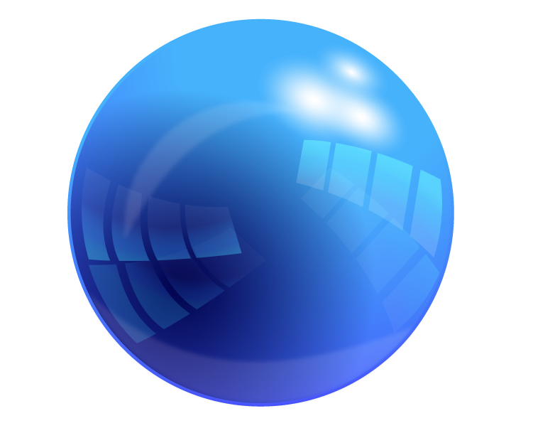
After our introduction to the glorious sphere, we branched out a bit more and found more interesting tutorials than that of a simple, red, sphere. It was then I dived into the realm of the SHINY. I found an absolutely BEAUTIFUL sphere tutorial right off of the bat (Found Here), and it wasn't easy, either! I  had to learn how to use\ things like compound paths and division tools to eventually come out with what you see to the left! I started with a sphere, then applies layers and layers of gradient on top of it to create the coveted reflective effect! I had to repeat many steps and redo a lot of shapes, but I feel it was worth it! It shines like a glass marble!


Then, after wrangling Illustrator, we hopped back over to the more familiar Photoshop, which didn't turn out to be as familiar as usual with this new tutorial! With a HEAVY use of layer masks and a rather simple look to it, this glossy sphere was a lot less complex in build than the Illustrator variety. I had to adapt to the use of layer masks, and have learned a few more tricks to mastering them! (except for the vector mask, I would like to learn and understand how that one works) I like the glow affect that sits around the edges, but not the biggest fan of the sudden cut off to the lighter gloss. I liked the softer tone better. For my own experiment, i put a textured type within the sphere, duplicating the main body and layering it between the two copies, the upper one with a lowered opacity to give the feel of being inside the sphere itself, like on of those bouncy balls with they toy dinosaur inside. I don't like it too much, but I try to follow the creative mantra of "Fail Faster", and did it anyway to see what i could manage with it, which wasn't as much as I'd have hoped. I had to keep it off center to prevent a clash  the composition with the corner of the G and the edge of the glare.

In contrast, the spheres have very different qualities to them. As always, the Illustrator sphere is more versatile. That doesn't go to say this Photoshop marble is without value! It is an easy format for the effect I tried to display, of objects within. I feel that it may have been cooler to make small bubbles of the sphere ad put them inside the sphere, like a carbonated drink. Each with their own color, but always a alight tint of the mother green. I found that In Photoshop, making a shadow is much easier. I don't have to worry about a stroke or a path, like in Illustrator, or worry about the shape not transforming the inner gradient with it. The blur is more appreciated there, Lastly, in contrast of the two methods, The Illustrator version's reflections and gradients are crisper and cleaner than Photoshop can normally acquire without some skill. In Illustrator, it more readily handles the crisp, sharp contrast of he brilliant shiny sphere, while Photoshop sits happily with it's fuzzy, blurry gradients that provide a warmer feel to them than a crisp and cold glare.


Sphere

Last week, we started working with spheres. We started out with a good, old, hand drawn sphere on paper. With a template, we went over values and shading that go into a sphere, creating the beloved optical illusion of depth on paper. here, we have my copy of the sphere page. I tried to stay away from pure white, and the effect made the sphere seem more muted in color, which is't bad, but not quite my aim for this one. I've always loved shiny things.

After our initiation to the sphere that i was, for the most part, VERY familiar with, We moved to the computer, and opened up Illustrator. Creating a sphere in illustrator isn't hard, and there are many simple ways to do it, but the red to black gradient we used just looks gross to me here. In hindsight, I should've gone with a darker read rather than flat out black. This would eliminate the muddy color and make it more appealing. Working with this newly made sphere is easy in Illustrator, with it's re-sizing capabilities, and makes for a versatile object.


On the other hand, we have Photoshop. I liked the look of this red sphere much more, a softer aesthetic and a gentle gradient. The shadow, however, I wish I had been able to use tricks I've only recently acquired on. It doesn't blur like I would wish it to. The difference in Photoshop, is that instead of manipulating a circle, you have a space filled with colored pixels that you cut off and them fill with a gradient. This makes the Photoshop sphere much less editable and versatile in almost any respect. Re-sizing such a sphere will make it pixel-y if the size is increased.


When it comes to preference, it's a tough choice. both methods are very different, and give similar results. I have found that, if I would like to have a sphere template, to which I can edit the color and glossiness with ease, then illustrator would be best, with it's gradient editor and paths. I like the look of the Photoshop sphere, and enjoyed making it more, but the uses are less outside of Photoshop itself.

It's a bit of a mental hoop to jump through to understand both Vector and Pixel graphics, but understanding both is a nice harmony and gives me a wider range of versatility.

Monday, October 6, 2014

Logo Development

Recently, it became relevant that I develop a logo for myself, so I dived into my sketchbook for some quick ideas to get me going. My two main thoughts involved a cube (Lined up isometrically or a little lower in angle) or something forming in the shape of a capital G, which is my first initial. Not too many people have names starting with G, so I feel that it's something rather personal that represents me. It's like one of my points of uniqueness.

I also took a rabbit, or a creature similar to a rabbit, into consideration with my design. Quite a bit of my presence online involves a bunny (Many usernames on art-based sites, and other places, are typically either Bunytech or Bunnytech, for days when I can actually spell check my information before hitting the 'done' button) and there is a lot of positive symbolism that comes with the image of that animal. Rabbits carry symbolism of luck, speed, wit, and motion (preferably in a forward direction). I want people to perceive me as a positive or energetic person, one that has the motivation to get stuff done.


So these were my sketches, and matter messing with the cube and the rabbit, I started to focus my attentions on the rabbit, as you can see below. I chose the colors Purple and green for personal reasons, but they also carry symbolism I'd like to affiliate with. The color purple is synonymous with both creativity and royalty, though the former is more of my goal with this model. Green, synonymous with nature, was a color I chose more to symbolize the green GO of a stoplight. I felt it went well with the idea of motion.

To start, I began messing around in illustrator with a box, but promptly gave up and decided to favor the running rabbit(?) idea.

I wanted to curve the rabbit into the shape of a capital G, letting it bend in the general 'C' shape, with it's ear pointing in to form the 'G'.

The most key thing I learned, in my opinion, was how to effectively manipulate strokes. With the aid of the might width tool, I finally surmounted one of my greatest challenges and conquered the vector path (To a pretty great extent). With this leap forward into illustrator, I have seemed to overcome my previous hurdle that was my relative intimidation from illustrator. Being used to the pixel-based programs of Photoshop and Autodesk Sketchbook, it was certainly a mental leap for me. I desire to be able to go further into the conveniently infinitely-scale-able realm of illustrator, for more versatile designs! 


Taking into account the picture above, of my nearly full art-board, I felt that I did well in the department of experimentation, I even tried things I felt may look stupid just in case!

And below, you ca see the finished(sh) product that I came up with! I was a fan of many of the designs, but some came out to cluttered, or took too much focus from what I personally wanted to achieve.

The end result was, in the end, the running bunny, which doesn't QUITE look like a bunny, but I feel it is close enough, looking like more of a jackrabbit with a cartoon-ish motion blur dashing behind it. The inner green circle turned into a green ring, which then became a hoop when i accidentally shifted one of the legs behind the ring, and by a happy accident, I had the bunny suddenly jumping though the newly made hoop. This flew by really well with others that saw it, and myself, so i gave it (the ring) a gradient to finish it up. The gradient gives a kind of a sunrise feel to it, and adds some visual interest beyond the flat shapes and color.


With that design in my head, i tested in in gray-scale.When I transferred it, i ditched the ring gradient, for it didn't add to the design at all in that state, and it looked much more balanced without it, but it still needed a bit more POP. So give it that visual interest, I gave the lighter colors, namely the ring and the eyes, a bit of a glow to contrast with any darker backgrounds that it may be placed on. 

That gave it a nighttime feel, and I can almost see a stark contrast in terms of daytime/nighttime between the two logos. I am very happy with the result!

In the future with these kinds of designs, I will try to do a batter job of catching little visual quirks that mess up the intended focus of the piece. I'd hate to come up with a nice design that people do not catch the cleverness of. Next time, I will make sure to take a step back form it, and collect much more feedback! But for now, I am quite content!

Friday, October 3, 2014

Shiny Shield tutorial


(Tutorial Link)

In the shiny shield tutorial, I went step by step to create just what the name implies: a glossy shield.
I went on my own with the colors, and could get the shape down easily! This tutorial taught me some applications for using the muti-stroke function, and how to use gradients to create luster.
In this tutorial, i feel that I did well with creating the shape and applying the styles, but I struggled mightily with the high gloss section in the corner. The way the tutorial described it (with the multiply function), wasn't working, so I changed it up a little bit.
Instead of using a black-to white gradient with a layer mask, i just used a simple white-to-transparent gradient for the gloss. It was much easier and got the same effect.

After this, I would like to go more in-depth in creating both high and low glosses on different shaped surfaces both 2D and 3D.

Thursday, October 2, 2014

Plausible impossible


My examples of Plausible impossible:


In this frame, Gus goose's neck is shaped like a tall sandwich. This is impossible, because swallowing something that large would both cause you to choke, and not change your neck's shape in such a way. But, it is plausible because he did just eat a large sandwich, and it hasn't been swallowed yet. his long neck just kind of has it sitting in there before he swallows it, therefore showing an outline.


In this frame, Gus Goose is eating spaghetti, unraveling it from the sock shape he knitted it into. This is plausible because noodles have the shape of string, and it wouldn't be too far fetched to be able to knit them. it is still impossible, though, for the noodles would break apart, and it wouldn't hold together. But in this situation, it makes sense for them to unravel nicely.


In this scene, Mickey is leading a procession of playing cards. This is impossible, since playing cards cannot walk. In this context, however, it is plausible because they are given arms and legs, and along with many other inanimate objects in the room, have human qualities to them. In cartoons, this is accepted as okay.


In this scene, dopey is hiccuping bubbles.  This is plausible because he has just swallowed a bar of soap. However, it is impossible, because even if you did eat a bar of soap, bubbles wouldn't form and come back up your throat. It is anatomically impossible.


In this scene, Dopey is swallowing soup. When he swallows the soup, it makes a sound like water draining down a pipe drain. This is plausible because he is drinking the soup fast, and it is draining into his stomach like it would in a drain. This is impossible because the sound of water on metal would not really happen in real life when you drank soup. But in cartoons, this sound effect gives you the same feel as to what is happening.