Thursday, September 25, 2014

Multiplane Animation

This week in animation, we messed around with perspective and backgrounds. We learned about a technique called the multi-plane camera, and how things at farther distances appear to move slower than things up close.

Here is what I came up with:
A chunk of scenery from one of the alien planets I enjoy developing in my free time. I call it Chi'Kciponn.


This project, like all the others, taught me knew things.

one of the biggest things I had to work with was blurring and shading things closer and further from the camera. I used more blurring on further objects to accompany the motion, and the things closest to the camera are darker and have less details, as they are closer than the camera projected focus of the layer before that.

The atmospheric changes in the backgrounds is also a subtle thing I messed with. There is a faint layer of clouds in front of the buildings, helping them blend back a little. So learned how to balance those changes as well.

Another thing I learned from this was some of the application of textures and brushes in photoshop in terms of making an object look less flat, and giving it more definition. The tree in front is my best example of this. It should be more defined and detailed than the ones the back, so I put extra effort into that one.

Tuesday, September 23, 2014

Google logo

The Google logo, one of the more famous of the logos, has an interesting story to it.


Based on the Catull typeface, this logo came a long way to where it has come to be now.
One of the earlier versions makes me chuckle a little:


(look at those 1990's graphics aha)

The original idea behind the colors was to stick to primary colors, but they turned the 'L' green as to show a kind of freedom from the rules, a kind of abstraction that Google can represent. Like they think 'Outside of the box'.

They chose 'Google' as a misspelling of 'Googol' (A number containing around 100 Zeros) to give the feel of their great number or resources and data speed.

The Google logo seems to also represent creativity in it's google doodles, where the simple logo is taken to new mediums with animations and celebratory designs.


Friday, September 12, 2014

Font anatomy


What's in a font?

Well, in class we each took a test to see what font supposedly describes each of us the best.
My font was Architype Van Doesman, accompanied with the traits of 
-Emotional
-Assertive
-Progressive
And 
-Disciplined

Architype Van Doesman is an interesting font where all letters take up an equal amount of space, and I find it very balanced.


Looking at these words, I find that they fit me in different ways.

I am indeed very emotional and passionate about the things I love, and will talk or work for hours on something that drives me.

When it comes to assertive, I do try my best to let my ideas be known to others, and will try quite hard to be heard over a din, or a noisy group. And I love to let my work stand out on it's own!

Progressive; now that's a word I can go with. I am always open to new tools and ways of doing things that will go faster and more easily! All the new computer programs and such, I love so many of them.

And in terms of disciplined, however, it's more of a loose term. I do meet my deadlines, and can be very particular about things, but there are some things where I cannot bring myself to commit. So out of the words, that one is the most iffy, but if I'm motivated and driven, i am VERY disciplined with my work!

Character Walk Cycle

My Character:

For our first character animation in this class, I drew a bird-cyborg character I've been drawing and working on for at least a year now. His name is Hahn, and he has some robot parts to replace parts of himself he lost in an attack on his town. The bird face is mostly for aesthetics, to be honest. And I felt that being able to animate Hahn would be very cool, since I've been doodling him for so long.

My Original Character Sketch:


We had to draw them in pieces so it'd be easier to animate!

When we got them into after effects (After coloring and refining them), the walk cycle took a while to piece together. It was a matter of timing the most ion of the torso so that the feet would seem to stay in place while he propelled himself forward.
First, I gave each leg a repeating cycle of forward and backwards, alternating with each other: that was the easy part. Then, I experimented with moving the torso forward in time with the feet, and gave him some up and down motion on each step to make it look more natural than simply moving forward. After I got past that part, I gave the arms some motion a little off timing to the legs, to give him more of a real feel, and less of a shape moving across a plane feel.

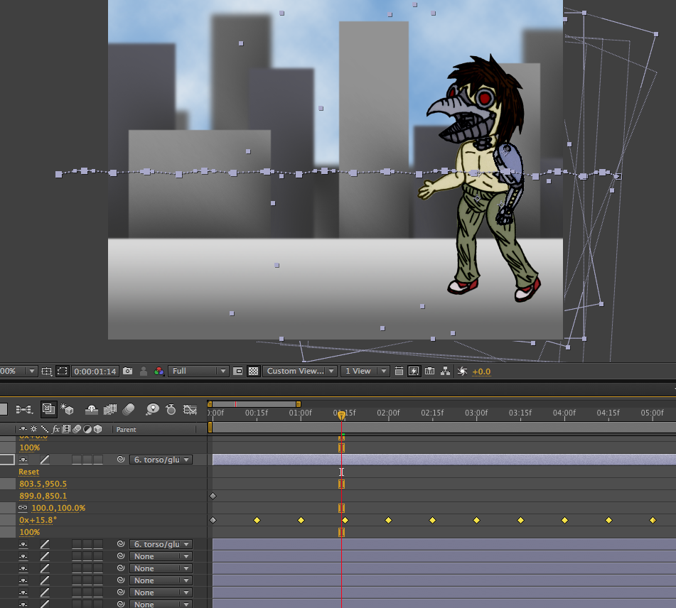
A Snapshot of my Timeline:


(The legs mostly used rotation for movement, rather than physical motion)

When it comes to my finished product, I learned a lot from it. I discovered that using the transparency grid as a reference point for movement help you keep something consistent in motion. I also discovered a good method for converting drawings in photoshop into easily manipulatable pieces in Aftereffects, like a paper doll you can assign the joints and regulate motion. the third thing I can pull form this assignment is what makes a walk cycle convincing. The trick, I have discovered, is to keep one foot on the ground at all times, and keeping it in the same spot. If you do this, the illusion of propelling themselves with that one foot while it stays there becomes much more real.
That last tidbit in itself was the hardest part of the whole process to nail down.

If I were to redo it, I would probably go in and give him some more give, like a bit of squash and stretch when he steps and such, as he goes by. And maybe give him some shading or a shadow so he isn't as flat.

Beyond that, however, I am in love with this animation, and I cannot get over how cool it feels to bring a character to life, and for the first time, see them DOING things! And I can only get better and better at it! I look to the future eagerly, and now I'm sure it would be the coolest thing to get After Effects at home so I can do things like this on my own in my free time!

My Finished Animation:

(I suggest viewing it at full screen for the quality at small size leaves much to be desired)


Friday, September 5, 2014

Inchworm Animation


This time in animation we learned about the puppet pin tool, and went though a tutorial on that tool and many more, with my work on that tutorial shown above. I feel that I spent more time on the tutorial than my original worm, so the second one did not turn out as well as the tutorial. It does make a difference how much effort and time you put into an animation.